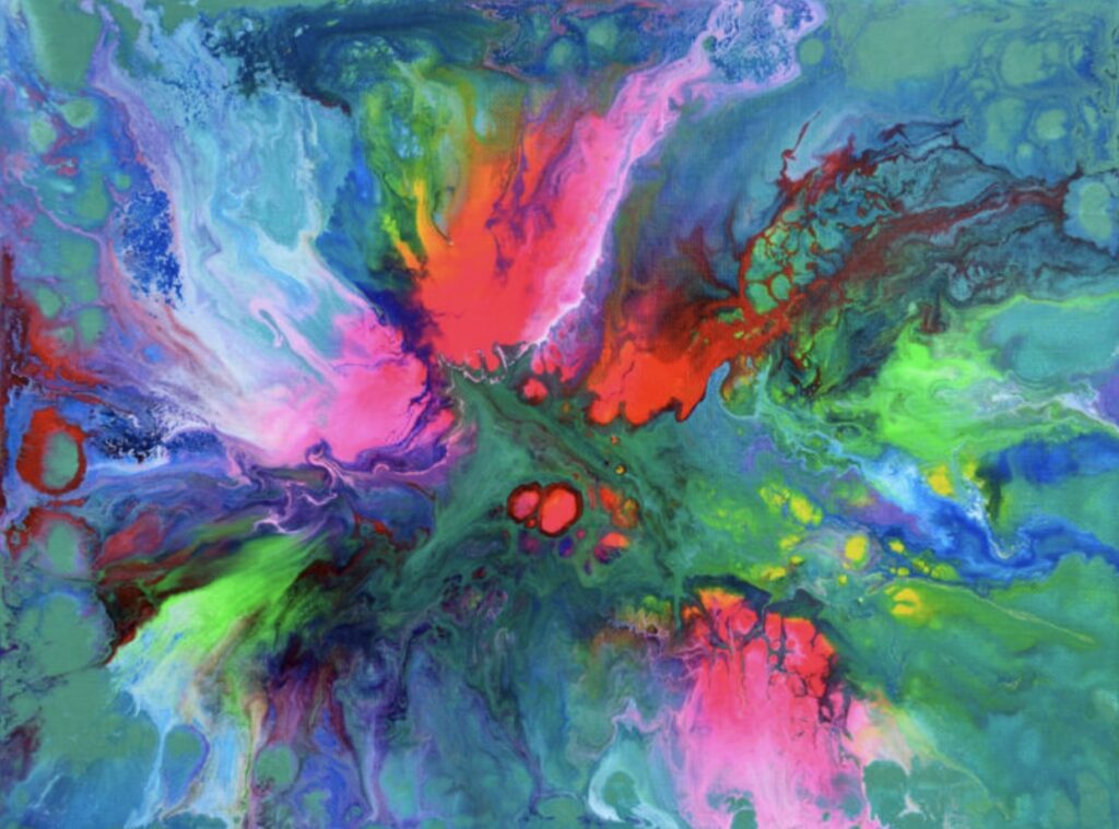
Have you ever looked at a photo and thought, “I like this color, how can I use it in my design?” Or maybe you’re working on a website or a digital project and want to match colors from an image perfectly?
That’s where a simple online color tool can save your time and help you make cleaner design decisions without any guesswork.
Let’s talk about how a tool like this can make your design process feel easier, more fun, and, honestly, quite satisfying.
Why Picking the Right Color Matters
Colors are everywhere, and when you’re working on any design—whether it’s a website, presentation, or poster – matching the right shade matters. Achieving the perfect tone in a photo makes your work look more polished and balanced.
However, it’s not always easy to select the exact colour by eye. That’s why having a tool that does it for you feels like a smart move.
A Simple Online Tool That Does the Job Well
There’s an online tool that lets you upload any image and instantly picks out the main colors from it. You don’t need to install anything or sign up. It works directly in your browser and shows you HEX and RGB codes with just one click.
If you want to try it out, the color image picker makes this process feel very smooth. You just upload your image, and it gives you all the key colors that stand out in that photo. It’s perfect for matching tones or creating a colour theme for your project.
Whether you’re doing social media graphics, building a website, or just working on something creative, it saves time and gives you good color results quickly.
How It Works Step-by-Step
You don’t need to be a tech expert. It works in just a few basic steps.
1. Upload Your Image
Just visit the website and upload any photo you like. It can be a selfie, scenery, logo, or product picture—anything.
2. See the Color Codes
The tool scans your image and shows you the most used or standout colors. You get HEX codes and RGB values right there on the screen.
3. Click for Exact Shades
Want a color from a specific part of the image? Click that spot on the picture, and the exact color code appears instantly. You can use it in your design tool or save it for later.
This method works well when you need perfect color matching, especially if you’re working on brand-related designs or personal projects.
Why Designers Love Using It
Most people who use this kind of tool feel more confident while choosing color combinations. Instead of guessing or using random color charts, you now have real colors taken straight from a picture.
Also, it’s easy to use on both desktop and mobile, so you can do it on the go or while sitting at your desk.
For students, freelance designers, digital marketers, or anyone who loves working with images, this saves effort and gives a more professional look to your final work.
When to Use It
Here are some simple cases when this tool can be helpful:
- You have a logo and want your website to match its color tone.
- You’re editing photos and need to keep the mood consistent.
- You want to copy colors from your favorite wallpaper or background.
- You’re making social media posts and need a fresh palette that works well together.
Simple Tip for Better Use
Try using clear images with good lighting. It helps the tool pick better shades. Also, if you want a soft or pastel tone, choose areas from the image that have gentle light—like the sky, fabric, or walls. For deeper tones, go for shadows or dark clothes.
Doing this will give you better control over what colors you pull out from the image.
Final Thoughts
Color picking doesn’t have to be complicated. When you have the right tool, it just feels easier to work smart. Using a simple online color tool helps you get exact codes in seconds, no guesswork, no wasting time.
So next time you’re stuck choosing colors, just upload your image, click on the color you like, and go ahead with your design. It saves time, looks neat, and gives your project that clean and tidy finish that always feels right.


