How to use the improved Stage Manager in iPadOS 17
Apple hasn’t radically changed how Stage Manager works in iPadOS 17, but it has made improvements that could be what it takes to make you use it more. Here’s how to use it.
Stage Manager on the iPad and the Mac is Apple’s attempt — or rather its latest attempt — to help users manage all of the document and application windows they tend to have open. The company seems to have decided to ignore Spaces, its previous main attempt, and leave that to people who’ve found it, while it presses on with Stage Manager.
That’s despite Stage Manager seemingly having failed to set the world alight. It might just be that it has yet to get any spark with users who have sought help with window management, though.
It could be that Stage Manager is already and quietly what a great many users need. In which case, they will be happy with the improvement that has come in iPadOS 17 — and this change may mean it suits more people.
The change concerns the size, shape, and adjustability of windows that you open while in Stage Manager. You’ve now got much more flexibility in how you use this feature, though oddly there is also a little more to criticize in it, too.
To see whether it makes a difference for you, you need to see it in the context of how you get in and out of Stage Manager.
Launching Stage Manager in iPadOS 17
- On your iPad, swipe down from top right to get Control Center
- Tap on the Stage Manager icon (three vertical dots to the left of a screen-shaped icon)
- Notice how there’s briefly a sign saying “Stage Manager on”
To get back out of Stage Manager, by the way, you do exactly the same steps. This time you’ll see that the Stage Manager icon in Control Center is highlighted.
Tap that to turn it off, and you’ll see a notification saying “Stage Manager off.”
You rather need these notifications, too, because otherwise if you’re on the iPad’s home screen, there is nothing to tell you that Stage Manager exists.
It only comes into play when you launch an app.

Launching and adding apps in Stage Manager
- Tap to open an app in your dock
- Notice that instead of opening full screen, the app squats in a smaller window, and the Dock disappears
- Find the grab handle at bottom left or right, and resize the window as you need
- Press and hold in the top row (except on the three dots) and drag to reposition the window
- Swipe up from the bottom of the screen to bring back the Dock
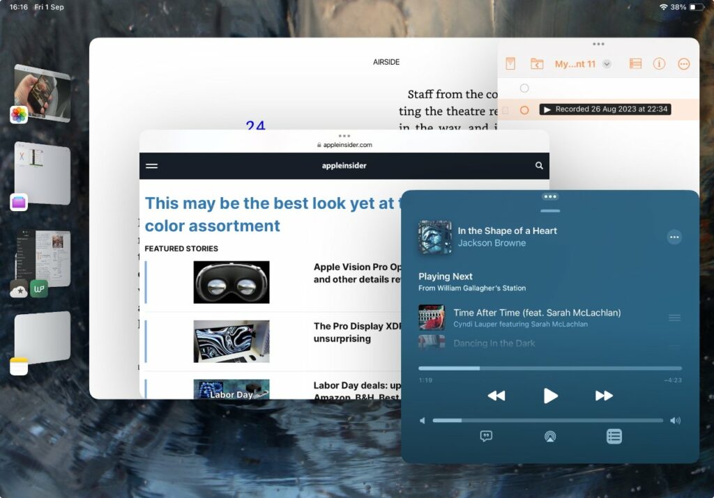
- Either tap or drag another app to launch it and have it on screen alongside the first one
Dragging an app up from the Dock is convenient, so long as the app you want is in there. And also so long as you drag carefully — let go at many different points and you don’t add the app to the existing one or ones, you open it as a regular full-screen app by itself.
And as long as you accept that the Dock is now going to vanish on you, regardless of whether you wanted to add any more apps. You have to swipe up again from the bottom of the screen to recall the Dock, then drag the next app out.
Nonetheless, the fact that the first app now opens in a slightly yet noticeably smaller window than before is good. It invites you to move and to resize it.
The big change in Stage Manager
So you now have this much greater flexibility in the size of app window you see when you switch to Stage Manager. It enormously helps to fullfil the feature’s purpose, which is to let you easily have two or more apps open on the screen at once, and yet be clearly able to read both, or skip between both.
Now when you open an app and Stage Manager is turned on, the app’s window adds a grab handle that looks like a little quarter-circle icon in the bottom left. Or the bottom right.
Or back to the bottom left.
In theory, the grab handle icon moves to one side or the other depending on how close that side of the window is to the edge of your screen. In practice, it doesn’t seem like there’s a lot in it and you will keep finding yourself tapping in the wrong spot.
Once you are correctly tapping and dragging, though, it’s pretty much up to you how you do it. Unlike, say, widgets, there’s no sticky guiding you to neat sizes or positions.
Which means it’s quite possible to make an ugly mess of overlapping apps and windows. As you drag, you can narrow a window so much that its fonts look awful, but then when you let go, iPadOS 17 does snap it back to wide enough that it prevents this.
Apple does also try to prevent a mess by limiting how many apps you can have open on screen at once, but it’s peculiar in how it enforces that limit.

Fiddly and even a bit ugly
You can only have four apps on screen at the same time, no matter how you arrange or squeeze them. Four is not an unreasonable number, even if there are times when you’re working across many more apps.
But what does seem unreasonable is what happens when you try to add a fifth. Drag any app up from the dock and it will turn into an open window that you can rearrange and resize as you need, just as you expect
Only, you’ve just lost one of your other apps. Apple didn’t tell you, didn’t offer an option, it just took the new app into its arms — while chucking out another one without a glance.
Consequently, it’s quite hard to arrange exactly the four you want and this is supposed to be the easy option.
You do get used to it, but there is one more aspect that is just wrong.

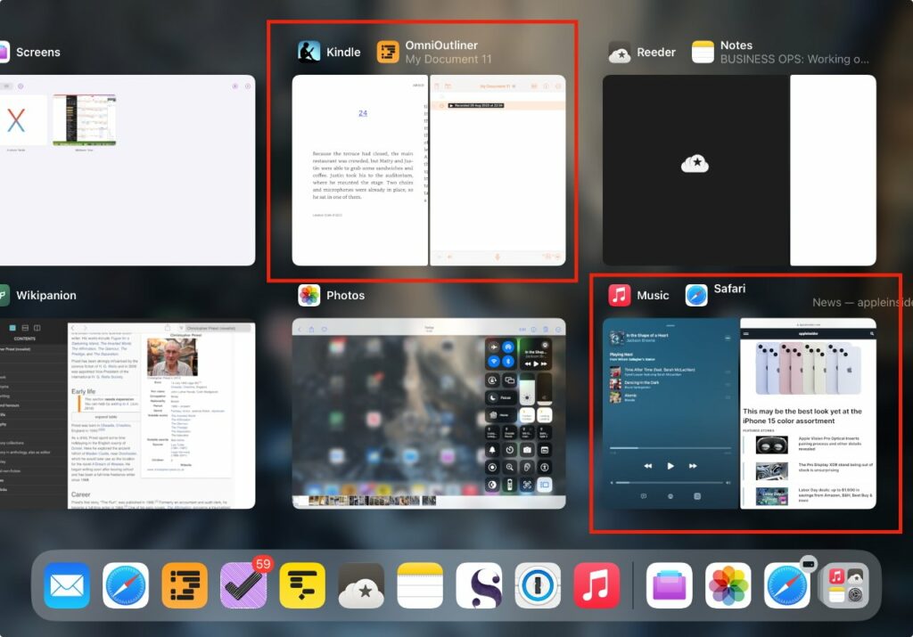
Say you switch off Stage Manager after you’ve grouped a few apps together while you were in it. If you now launch one of the apps you’d been using, it will appear half screen and paired with one of the other apps.
You have chosen to come out of Stage Manager but it hasn’t returned you to normality, it’s created this artificial pairing.
Actually, it’s done it twice. If you had four apps open in Stage Manager, you now have two pairs of apps arranged in two Split Views.
There must be a logic to which app gets paired with which, but it isn’t obvious and anyway, it’s not what you wanted.
And yet Stage Manager is useful
With an iPad, you can always do a five-finger swipe across the screen and move to a different app that you’ve got running. But having two or apps on screen at the same time is immeasurably better.
For instance, it makes referring to two apps and working in two apps, easier than forever having to swipe to switch. Sometimes you can just glance to see what you need from the other app, and when you have to switch to it, it’s faster than any other way.
Then, too, if you have a 12.9-inch iPad Pro, you’ve got more screen real estate to play with. And now with iPadOS 17, that means you have more scope for placing and arranging windows to better suit you.
So if you are not routinely in a dozen apps, but you’re also never in just one, Stage Manager can help. And the change with iPadOS 17 is definitely a step forward, but maybe the journey has a few more steps to go.


