 By
By DESIGN.md: The Missing Link Between Design Systems and AI Coding Agents
Key Takeaway:
DESIGN.md turns your design system into a single, agent-readable markdown file that keeps AI coding agents aligned with your brand’s visual identity across every generated screen.
AI design tools like Google Stitch can now generate full interface layouts from prompts, but keeping those UIs consistent across multiple screens, agents, and tools has been a persistent problem. Design rules often live in scattered Figma files, internal docs, or a senior designer’s head, while coding agents see only isolated prompts and fragments of code. As a result, the same project can end up with mismatched colors, typography, and spacing whenever an agent’s context window resets.
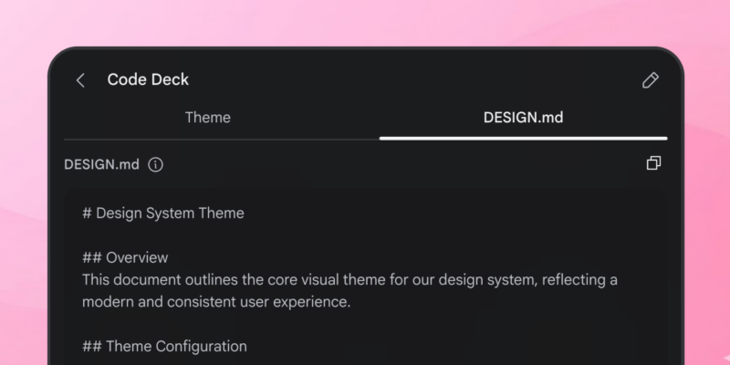
DESIGN.md is Google Labs’ answer: a portable markdown file that serializes a project’s design system—colors, typography, spacing, components, and visual constraints—in a format LLM-based agents can read directly. Introduced as part of Stitch’s “AI-native design canvas,” it functions like a README for visual identity: one file that encodes how the product should look and feel, regardless of which tool consumes it. Instead of hoping the model infers your brand, you hand it a concrete, machine-readable spec.
What DESIGN.md Actually Is
At its core, DESIGN.md is just a markdown document that captures the minimum set of design decisions an AI agent needs to produce consistent UI. The format is intentionally human- and agent-friendly: headings, bullet lists, and short natural-language rules grouped into sections that mirror a typical design system.
Common sections include:
- Overview and design principles.
- Color palette with semantic roles and hex values.
- Typography scale with font families, sizes, and weights.
- Spacing, layout, and elevation rules.
- Component patterns (buttons, inputs, cards, navigation).
- Do’s and don’ts that constrain how styles are applied.
Tools like Stitch can export DESIGN.md directly from a canvas, but you can also author or refine the file by hand, which is particularly useful if you want agents like Claude Code, Cursor, or Gemini CLI to follow the same visual rules across repositories.
Where DESIGN.md Lives in Your Repo
To make DESIGN.md discoverable for agents and easy for humans to maintain, it should live alongside your code, not buried in a wiki or a design-only tool.
Typical locations are:
- At the repo root:
design.md. - In a docs folder:
docs/design.md.
The key is that a coding agent can load the file with a single command or API call when working in the repository. For example, many editor-integrated agents can be instructed to “open design.md at the repo root and use it as the design reference” before generating any UI code.
Basic Structure of a DESIGN.md File
A minimal but useful DESIGN.md might start with a high-level description, then move into colors, typography, spacing, and components.
# Acme Dashboard Design System

## Overview
A clean, data-focused B2B dashboard with high contrast, low visual noise, and clear hierarchy.

## Design Principles
- Prioritize readability over visual flair.
- Use motion sparingly and only to indicate state changes.
- Keep layouts grid-aligned with predictable spacing.
From there, you expand into tokens and rules that an agent can apply reliably. The goal is not exhaustive documentation, but a concise, opinionated spec that is easy for an LLM to parse and follow.
Defining Colors with Semantic Roles
Raw hex values are not enough; agents need to know when and where to use each color. In DESIGN.md, colors are typically defined as semantic tokens with both a value and a usage rule.
## Colors
- **brand-primary** (#2563EB): Main CTAs and primary links.
- **brand-secondary** (#0EA5E9): Secondary actions and accents.
- **surface-default** (#0F172A): Page background for dark UI.
- **surface-elevated** (#111827): Cards and panels.
- **text-primary** (#F9FAFB): Main text on dark surfaces.
- **status-error** (#EF4444): Destructive actions and error states only.
This pattern ensures an agent does not, for example, use the error color as an accent or flood every button with the primary hue. By pairing names, values, and roles, DESIGN.md gives both humans and models a shared vocabulary for color decisions.
Specifying Typography Rules
Typography definitions in DESIGN.md capture font families, size scales, weights, and usage guidelines for different text roles.
## Typography
- **Headline**: Inter, 32–40px, SemiBold; used for page titles.
- **Subheadline**: Inter, 20–24px, Medium; used for section headers.
- **Body**: Inter, 14–16px, Regular; default for long-form text.
- **Label**: Inter, 12px, Medium; used for field labels and meta text.
- **Mono**: JetBrains Mono, 13px; used for code and numeric data.
Clear roles prevent an agent from mixing fonts arbitrarily or using oversized headings for minor labels. When a prompt asks for “a settings page that matches our typography rules,” the agent can map each text element to one of these named styles.
Encoding Spacing, Layout, and Elevation
Spacing and layout rules keep auto-generated screens from feeling either cramped or randomly padded. DESIGN.md usually includes a spacing scale and base grid unit.
## Spacing & Layout
- **Base unit**: 4px.
- **Scale**: 4, 8, 12, 16, 24, 32, 48, 64.
- Vertical spacing between sections: 32–48px.
- Horizontal gutters between columns: 24px.
- Corner radius: 8px for cards and inputs.
- Shadows: one subtle elevation level for hover and active states.
By describing layout primitives in natural language plus concrete values, the agent can translate your intent into grid systems, flexbox gaps, or utility classes in frameworks like Tailwind or Material-based design systems.
Documenting Components and Interaction Patterns
Beyond tokens, DESIGN.md shines when it describes how components should look and behave. This includes visual variants and interaction states.
## Components

### Buttons
- Primary: brand-primary background, text-primary label, 8px radius, 12px vertical padding.
- Secondary: transparent background, brand-primary border, text-primary label.
- Hover: increase brightness by 8%.
- Disabled: 40% opacity, no hover state.

### Cards
- Background: surface-elevated.
- Border: 1px solid with subtle contrast.
- Padding: 16–24px depending on density.
- Never nest more than two card levels.
Rules like “never nest more than two card levels” or “use only one primary button per view” give the model guardrails that are hard to infer from tokens alone. Over time, teams can extend this section with form patterns, navigation behaviors, and animation constraints.
Using DESIGN.md with AI Coding Agents
Once design.md is in your repo, the next step is to wire it into your AI development workflow so agents consistently read it before generating UI.
A typical flow looks like this:
- Design or refine your UI in Stitch (or an existing product) and export or author
design.md. - Commit
design.mdto the root ordocs/folder of your repository. - In your editor (Cursor, VS Code with Claude, Gemini CLI, etc.), instruct the agent to open and internalize
design.md. - When prompting for new screens or components, explicitly reference it, for example: “Using the rules in
design.md, build a React settings page for managing API keys.” - For changes, update
design.mdfirst, then ask the agent to refresh its understanding and refactor existing UI to match.
Under the hood, Stitch’s skills and MCP integrations already automate part of this pipeline, letting agents analyze screens and emit an up-to-date DESIGN.md file for the coding environment. But the same principle works with any AI tool that can read markdown from your repo.
Official Resources and Emerging Ecosystem
Google maintains the canonical DESIGN.md skill and related tooling in the google-labs-code GitHub organization, where you can inspect how the skill analyzes Stitch projects and writes the file. The repository at https://github.com/google-labs-code/design.md describes how the skill extracts color palettes, typography, and layout rules and converts them into a structured markdown spec for agents.
Third-party projects now provide ready-made DESIGN.md examples for popular products and developer-focused brand styles, which you can drop into a project as a starting point and then customize. These community files reinforce the same core structure—overview, colors, typography, spacing, components—making it easier for multiple tools to converge on a shared mental model.
Best Practices for Writing DESIGN.md
Teams adopting DESIGN.md tend to converge on a few practical guidelines:
- Keep it close to reality: derive colors, typography, and spacing from the product you actually ship, not a hypothetical redesign.
- Keep it in the repo: store
design.mdalongside your code so agents and humans see the same source of truth. - Be opinionated, not verbose: short, specific rules beat long prose for LLMs.
- Name tokens semantically: favor
status-errororbrand-primaryover purely numeric names. - Treat it as living documentation: update the file whenever you change visual direction, and rerun agents against it.
By combining design tokens with plain-language constraints, DESIGN.md gives AI coding agents a durable, portable representation of your design system. Instead of re-teaching your brand rules in every prompt, you wire them into the project itself—and let the agents read from the same file your team maintains.
For implementation details and updates to the specification, see the official GitHub repository at https://github.com/google-labs-code/design.md and Google’s Stitch documentation when it becomes publicly available.